Guide at making Github profile appealing
Introduction
In this guide, you will learn how to create a appealing and beatiful Github profile. Read until the end to make your Github profile 100% better!
Question: Why do I have to even care about Github profile page?
The reason you should make your profile page appealing is because similar to portfolio, the content of your Github profile page is what people will look to try understand what kind of person you are. Having great profile user/README.md file is not required, but it is still something free that you can use to build your reputation.
Editing your user/README.md file
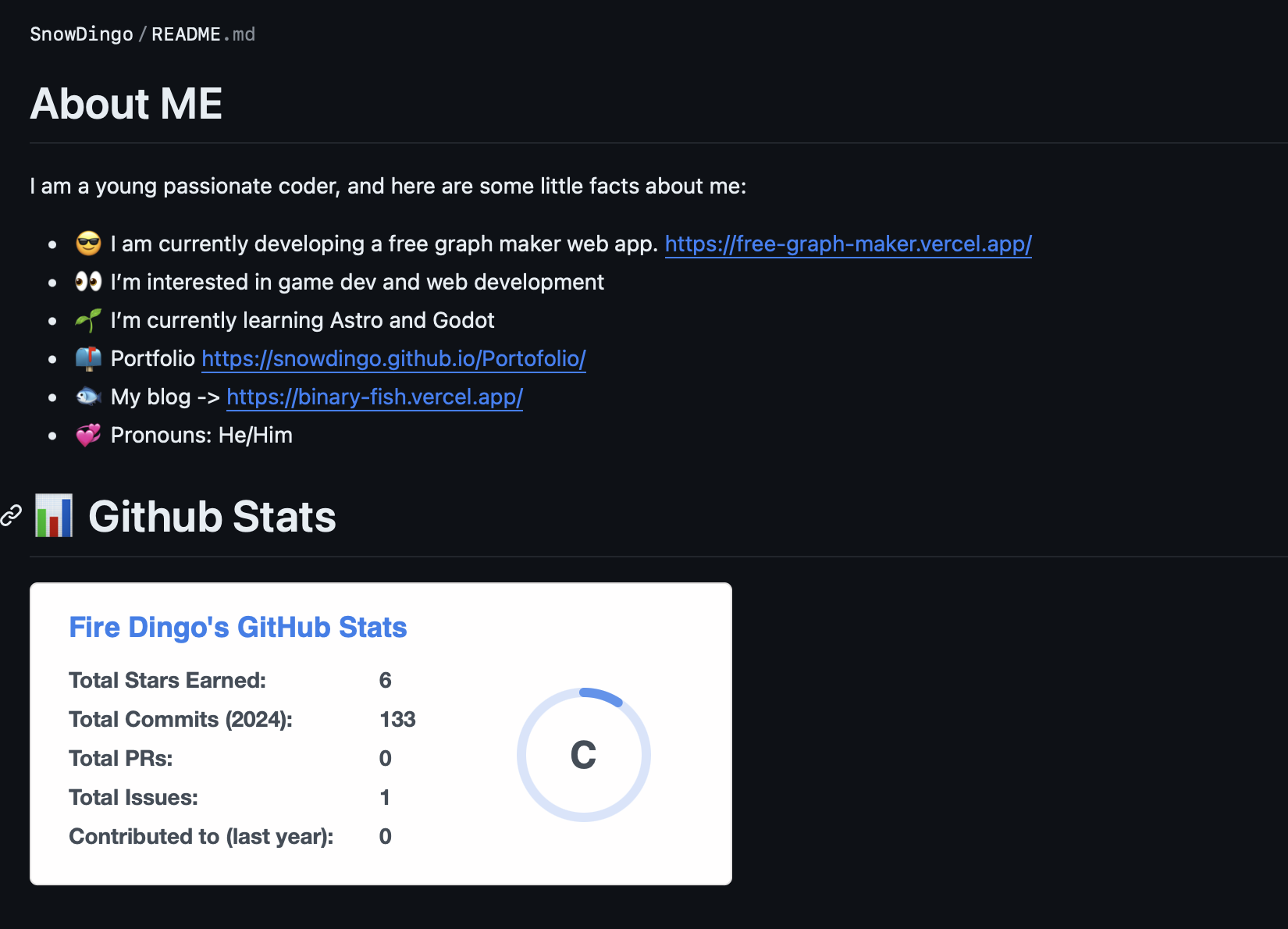
For each account, Github gives you access to one README file that could be written as a profile. The content of README file will be displayed on its user’s profile, like the image shown below.

This can be used to tell not only about yourself, but your projects and portfolio as well. The important thing is that this profile page could be written in readme format, meaning that it supports far more variety of content to display than normal Github profile description.
Step 1: List out things about yourself.
The first step at creating appealing Github profile is to make a list about yourself. This should probably include your main language, goals, visions, and some links to your projects or portfolio.
You could use list formt - abcd to display each information in bulleted list form.
Here is a template that you can copy and paste into your own README.
# About ME
I am a young passionate coder, and here are some little facts about me:
- 😎 current status
- 👀 Your intrest/curiocity/field
- 🌱 What you are learning
- 📫 Portfolio/contact information
- 🌟 Additional information(Like your nationality.)
- 💞️ Pronouns(Extra)
Step 2: Use Github Stats to display your Github status
This already looks great, but there is another thing that you can put into your Github profile README file. There is a tool called Github Stats, which allows anyone to put their Github statistics inside your profile. There are plenty of customization available, but this guide will not go full depth into this so please visit the link below for detiled guide at using this.
Sample
Here are some of the sample cards you can copy and paste into your README file.
Simple:
Dark theme:
Gradient:
Github extra pins:
(https://github.com/SnowDingo/BinaryFishBlog)
(https://github.com/SnowDingo/BinaryFishBlog)Github language chart:
Top language without chart:
Step 3: Final adjustments
For final adjustments, make sure to check for any speeling or grammar erros in your profile. Futhermore, you can try adding some emojis if your README looks too professional.
Conclusion
This guide explained how to make your Github profile appealing in 3 simple steps. Again, Github stats has plenty of things to customize so we reccomand readingg their guide onece. Sharing our website through social media platforms will be greatly helpful. Thank you for reading.