CSS Margin VS Padding in a nutshell
When working with CSS, it is very beneficial to know the difference between CSS margin and padding. It is widely understood by numerous people that the two properties are spacing properties, but there are only a few engineers who understand the true difference between these properties. Let’s dive in!
CSS Margin VS Padding
Padding
In CSS, padding is a property that sets the inner spacing of a CSS element. In a nutshell, the padding determines the spacing of the inner area.
Padding has four sub-properties that you can use to specify the spacing.
- Padding-Top
- Padding-Bottom
- Padding-Left
- Padding-Right
Instead of specifying the padding of each direction using every one of these sub-properties, you can also select the same value in plain padding property like this:
padding: 2px 2px 2px 2px; /* From left=>right: Top, Right, Bottom, Left */For more details about padding, visit the MDN docs.

Margin
The margin, on the other hand, sets the spacing of the outer element. It is used to create an actual space between one component with the other.
Similar to padding, there are four sub-properties like padding-bottom and padding-right.
You can also easily apply a margin of four directions in plain margin property like this:
margin: 2px 2px 2px 2px; /* From left=>right: Top, Right, Bottom, Left */For more details, visit the MDN docs.

In Tailwind CSS
In tailwind CSS, margin and padding can be applied by using the following class:
Padding:
p-2
Margin:
m-2
‼️ Never use padding for positioning
Many beginners fall into this trap of using padding for positioning and mixing up the roles of each property. While some uses are acceptable in web design, it is not a good idea to use padding for positioning elements. This is because the true role of padding is to extend the border of the elements(the inner spacing), not to adjust the spacing of the elements. In addition, using margin instead of padding for positioning gives more clarity and consistency to your code from a third person’s view. So, use margin instead of padding when it comes to the positioning of elements.
So Padding VS Margin
According to the MDN Web Docs, margin and padding can be explained in the following sentence:
Padding creates extra space within an element. In contrast, a margin creates extra space around an element.

In a nutshell, while padding creates an inner space of an element, the margin determines the outer spacing.
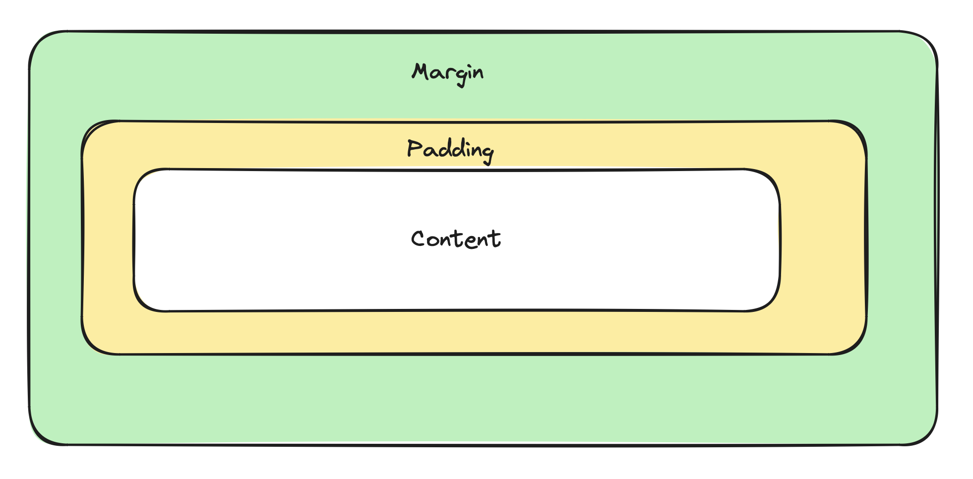 A diagram representing the relationship between the content, padding, and margin
Now that we know what is the difference between these two properties, how should we determine which one to use? In this guide, we created a table that anyone can use to determine which one to use:
| Margin | Padding | |
|---|---|---|
| Creating space between two or more items | ✅ | ⚠️ |
| Adding space between text and the border of a button | ❌ | ✅ |
| Space between the header/footer and the body | ✅ | ❌ |
QUIZ:
Now take our two-question test that tests your knowledge from this guide. The answer is in the very end.
-
How do you apply a 2px margin to a
pelement? -
Which one is the correct use of padding? A. Creating spacing between the header and body B. To modify the positioning of an element C. To create inner space in its element.
Conclusion
Throughout this guide, we explained a quick overview of CSS margin and padding, with its differences.
We hope this guide helped you in your web design journey.
Lastly, we would appreciate it if you could share our posts and blog on social media using the hashtag #BinaryFish.
Thank you for reading.
Recommended posts
Quiz Answers:
margin-right:2px;- C
Image Attribution
Photo by Rodion Kutsaiev on Unsplash